MELOKO
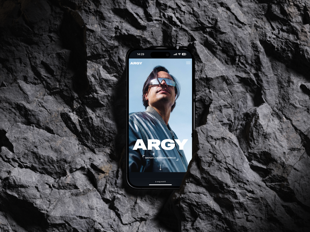
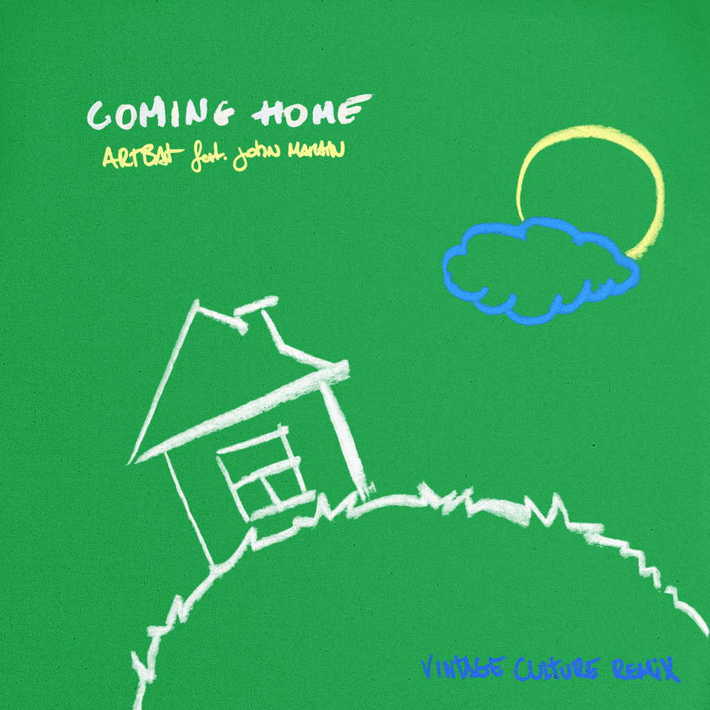
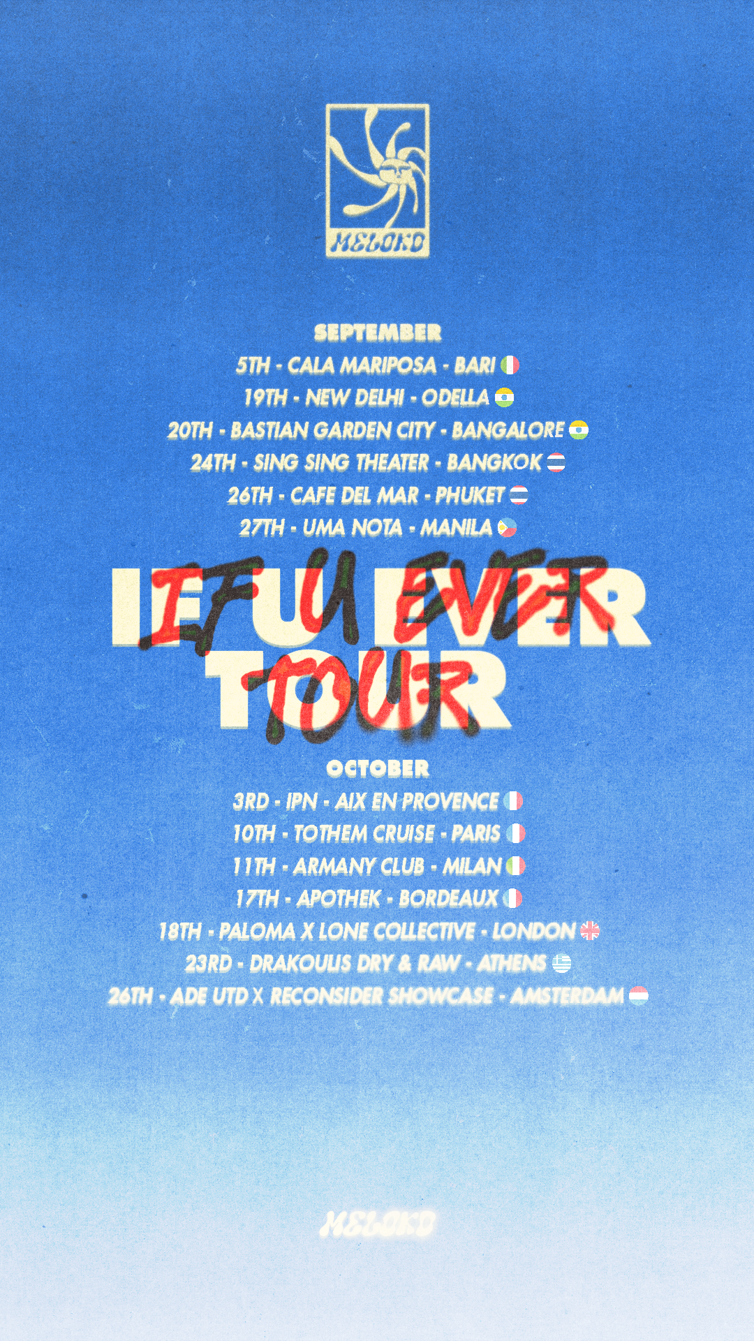
Meloko came to us as an artist with a clear aesthetic and an international agenda. What he needed was a visual identity strong enough to carry it — something that worked as a logo on a flyer, as a wordmark on a poster, and as a brand across every platform. We built it from the ground up: logo, colour palette, typography and a full visual identity that travels as well as he does.
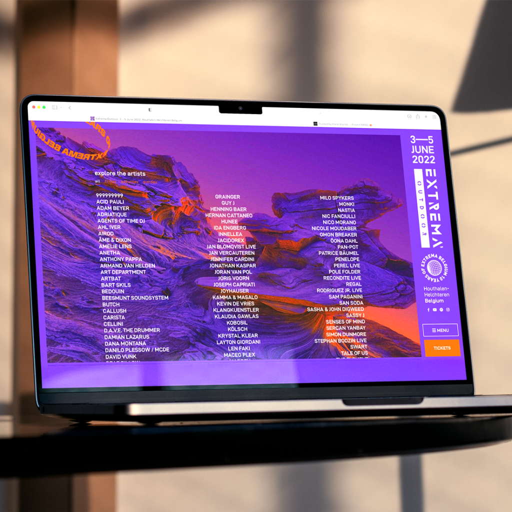
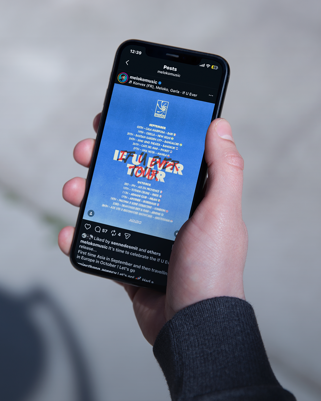
From there we rolled out the tour visuals. Season after season, we designed and updated the tour date posters — adapting the visual language each time while keeping the identity consistent. Brussels. New York. Los Angeles. San Francisco. Bangkok. Hong Kong. Manila. Singapore. Switzerland. Colombia. The dates changed. The standard didn't.
Art Direction
Branding
content design
icon
Logo
typography
Branding
content design
icon
Logo
typography
Want something like this for your project?
Tell us about it. We'll tell you how we can make it happen.